Crafting Compelling Calls-to-Action That Convert
Ever landed on a website, read something interesting, and then wander around until you leave? Maybe there was no prompt, no direction, no invitation to take the next step. No matter the why, a website that doesn’t make it clear what you should do next is a massive missed opportunity. And that’s achieved through compelling calls-to-action (CTA).
Whether you’re trying to get someone to book a call, download a lead magnet, make a purchase, or attend an event, the CTA is where the magic happens. It’s not just a line of text or a button at the bottom of the page. It’s your chance to turn passive visitors into active leads, clients, or customers.
But writing CTAs that actually convert? That takes more than slapping “Learn More” on a button and calling it a day. The best CTAs are clear, action-driven, and customized to what your audience needs right now.
In this article, we’ll break down what makes compelling calls-to-action work and how you can write smarter, sharper calls-to-action for your website, emails, and ads. You’ll get practical tips, real examples, and ideas you can use right away to start seeing better results. Let’s get to it.

1. Be Clear and Direct
When it comes to CTAs, clarity beats cleverness every time.
If your call-to-action leaves people guessing, they’re far less likely to click. You don’t want visitors wondering, “What happens if I click this?”
You want them to know exactly what to expect, whether that’s scheduling a call, downloading a guide, or signing up for updates.
Phrases like “Click Here” or “Learn More” may sound familiar, but they’re too vague to motivate action. Instead, be specific. Tell people what they’re getting and what they should do next.
For example, compare these:
- Learn More: Vague and doesn’t tell you much about what to expect when you click.
- See Pricing & Packages: This one’s specific. You know what information you’ll see.
Or take another comparison as an example:
- Submit: Yes, you know that the form will be submitted, but to where? Why? What?
- Get My Free Estimate: A CTA like this is specific. You know what clicking the button will do.
The clearer your CTA, the more confident your visitors will feel taking the next step.
If you want to see this in action, check out the Synergy Counseling homepage. Rather than a generic prompt, the call-to-action says exactly what a visitor can do: “Find My Therapist.”
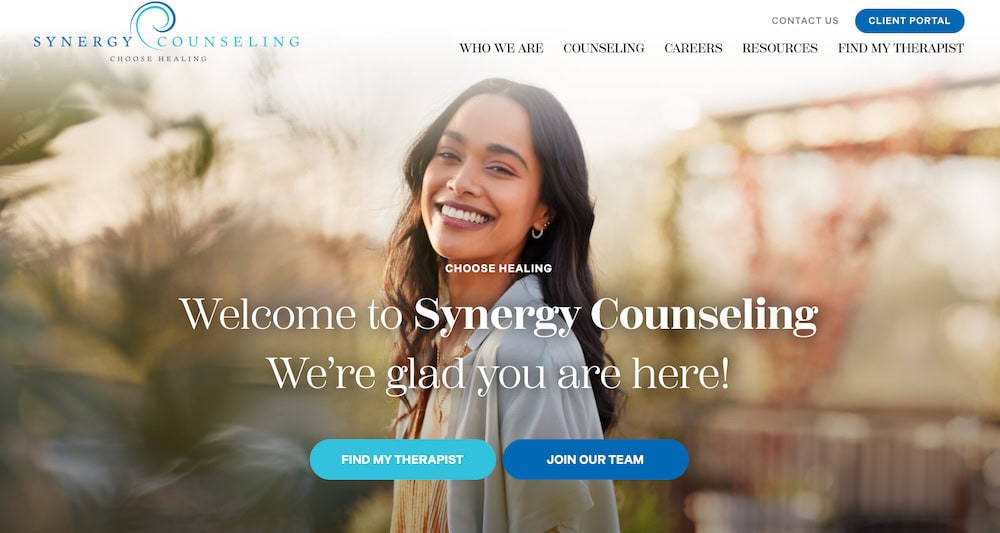
There’s no guesswork and that’s what makes it effective.
2. Use Action-Oriented Words
The best CTAs aren’t passive. Instead, they’re active in the word choices used within them.
That starts with strong verbs. Your CTA should begin with a clear instruction that sparks movement of some kind. Think “Download,” “Schedule,” “Start,” “Try,” “Get,” or “Request.” These words do more than tell someone what to do. Instead, they make it feel easy, immediate, and purposeful.
Here’s a quick comparison:
- Passive: Our team is here to help
- Action-Oriented: Schedule Your Free Consultation
Or:
- Passive: We have a new resource available
- Action-Oriented: Download the New Homeowner Guide
The difference might seem small, but action-oriented CTAs tap into that split-second decision-making moment. They remove the urge to put off taking that next step and give people a reason to click now.
Take a look at the Marshall Roofing site. You’ll see the CTA, “Schedule an Estimate,” which starts with a high-impact verb and immediately tells visitors what they’ll receive.

3. Create a Sense of Urgency or Value
Even the best CTA can fall flat if it feels optional. That’s why injecting urgency into your CTAs matters so much.
You want your audience to feel like now is the right time to act and that doing so will get them something worthwhile. This doesn’t mean using fake scarcity or pressure tactics though. Instead, it means making the benefit clear and giving people a reason to take action immediately instead of waiting around to do it later — if ever.
A few examples for adding urgency to your CTAs include:
- Schedule Today! Spots Are Filling Fast
- Limited Time Offer
- Book Now for Spring Availability
Using urgent phrasing really shines when it’s coupled with value, however. Use phrases like the following to get your point across:
- Get Instant Access
- Download Your Free Checklist
- Start Saving on Repairs Today
Urgency taps into the fear of missing out (FOMO) while value shows what someone will gain. Together, they make your CTA far more compelling.
A good example of this can be found on the Vander Outdoors website.

Their CTA doesn’t just say “Contact Us.” It invites users to “Book Your Adventure,” a clear value-driven benefit that feels too good to put off.
4. Match CTA to the User’s Journey
Not every visitor lands on your site ready to commit, and honestly, that’s okay.
What matters is offering the right call-to-action based on where someone is in their decision-making process. Someone just browsing your homepage might not be ready to “Book a Consultation,” but they may click “View Our Work” or “Read Client Testimonials.” That’s called a transitional CTA. It keeps people engaged and moving forward without forcing them to take a leap when they’re not ready to do that yet.
On the flip side, someone who’s already spent time on your services or pricing page might be ready for a direct CTA, like “Request a Quote” or “Schedule Your Free Estimate.”
Think of it like guiding someone through a conversation. If they’re just getting to know you, you wouldn’t ask them to make a decision right away. But if they’re leaning in and asking questions? That’s your cue to invite action.
You can see this balance on the Pinnacle Stone Care site.
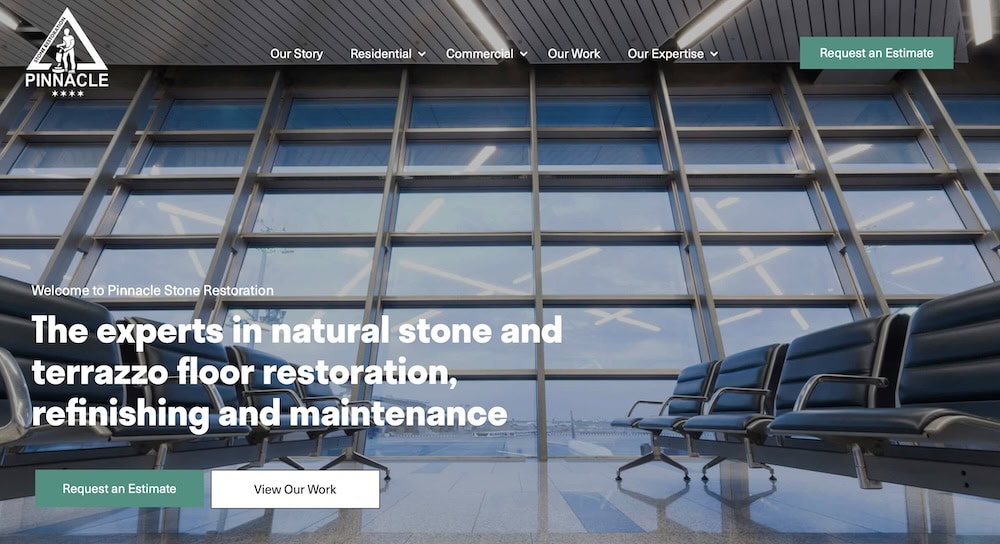
Their homepage offers softer prompts like “Request an Estimate” perfectly timed for someone further down the funnel.
5. Make It Visually Stand Out
Even the best-written CTA won’t convert if no one sees it.
Design plays a huge role in how effective your call-to-action is. Your CTA should be impossible to miss, but not in an obnoxious, flashing-banner kind of way. Instead, use clean, intentional design choices to draw the eye and guide visitors on where to click.
Start by using a button, not just a text link. Buttons naturally signal interactivity and action. Then, consider these the following elements:
- Color: Use a contrasting color that stands out from the rest of your site but still fits your brand.
- Size and spacing: Make it large enough to be easily clickable, with enough breathing room around it.
- Placement: Don’t rely on a single CTA at the bottom of the page. Sprinkle it in where it makes sense, especially after explaining your services, sharing testimonials, or presenting some kind of value.
Check out Tails ‘n Whiskers Pet Services.
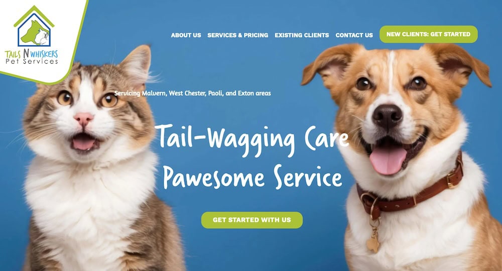
Their “Get Started With Us” button uses bold color, clean design, and smart placement.
6. Test and Optimize CTAs Regularly
Even strong CTAs can be made stronger with the right adjustments.
What works on one page or for one audience might fall flat somewhere else. That’s why testing is so important. A/B testing lets you compare different CTA phrases, button colors, placements, or even styles to see which version drives more clicks, signups, or sales.
Start simple. You don’t need to overhaul everything at once. Try changing just one or two things like :
- The verb choice: Opting for Get” vs. “Download” could make a big difference.
- The benefit or value offered: Swap out what you’re providing. Is it a “Free Quote” or a “Personalized Estimate”?
- The position: Experiment to see if placing the CTA at the top of the page or. after a testimonial works better.
Once you make these changes, monitor your results. Even a small improvement in your conversion rate can make a big impact over time, especially if your CTA appears across multiple areas of your website’s design like your homepage, landing pages, blog posts, or email campaigns.

Small Changes Bring Big Results for Compelling Calls-to-Action
Your CTA might be a small part of your page but it matters. A lot..
When written well, it gives your visitors clarity, motivation, and a clear next step. The right CTA can boost signups, increase sales, and turn casual browsers into loyal customers. And as you’ve seen, it’s not about being flashy or obnoxious. Rather, it’s about being intentional.
If you’re not sure whether your current calls-to-action are pulling their weight, or if you’re ready to improve how your website guides users toward conversion, we can help. Johnny Flash Productions works with businesses like yours to refine messaging, improve site design, and create CTAs that actually convert.
Reach out today and let’s make your website work harder for you.
Share this post
Newsletter Sign-Up
"*" indicates required fields
We focus on beautiful web design that delivers results for your organization. Our specialty is creating customized WordPress websites.
About Us
Johnny Flash Productions
Johnny Flash Productions is a creative agency based outside of Washington D.C. that focuses on digital strategy, web design and development, graphic design and event production that helps businesses get better results from their marketing.

John has been managing my website SEO and Google Ads for only a few months now and his services have already generated profitable leads. I can’t say enough about his company’s professionalism, promptness and results oriented approach. Hiring his company has been an excellent business decision!!

Johnny Flash Productions is a company that truly cares about their clients, this is obvious by not only their work ethic but they also the way they put their heart into every project they complete.
Johnny Flash Productions was a pleasure to work with, we look forward to working with them again in the future.

I was looking for a web designer who was not only talented, but could deliver - and keep delivering what I needed month after month. The team at Johnny Flash Productions brought ideas to the table that complemented what I wanted to do with my website and their design exceeded my expectations.
I was willing to pay more for their continuing monthly service than I had paid previously because they laid out what I could expect from their team. So far, they have under promised and over delivered.

We were so grateful to have found Johnny Flash Productions to help us with our marketing needs. Their work was above and beyond what we expected. The staff are very competent and great to work with. Excellent results!

Johnny Flash Productions, is an Internet Marketing Industry Expert. I've had the pleasure of interacting with him in a Marketing Mastermind group, and as an industry person, I can say with confidence that John knows his stuff. He's an Expert's expert. His processes are solid, and he knows how to solve problems, and drive leads to your business. He's the real deal.

In a matter of weeks, the Johnny Flash team was able to help Care With Love immensely with ideas as well as practical implementations regarding our website and marketing plans. Their team is professional, responsive, and exemplify great customer service. Well done Johnny Flash Team!

Exceeded all expectations in their abilities to professionally evaluate and customize our company WordPress website. Above all else, their customer service is the best I've dealt with in a long time with any company I've worked with in the past. I definitely recommend Johnny Flash Productions to anyone looking for exceptional service, professional detail and customer support.

I would like to thank Johnny Flash Productions for there great service my company has been able to get to get to the top of Google searches in half the time most companies take. I am now receiving 3 to 5 viable leads a day that all lead to service work for my company. And I can not thank them enough for all of there support with my site and maintaining it for me.

We've worked with John and his team for several years on multiple projects. They deliver great work on time, on budget and with solid ongoing support. We highly recommend Johnny Flash Productions!

I have worked with Johnny Flash Productions on 3 of my own websites and recommended Johnny Flash productions to two other family members who were also in need of new websites. We have all had an exceptional experience during the process.
The staff are very responsive, organized, on time and they follow through until the work is complete. We valued them so much that we use them for our monthly maintenance and they help with our advertising online.

Their knowledge of SEO and integration of social media channels improved our church's online impact.
We had a phenomenal experience working with the Johnny Flash Productions team for our new website, SEO, and logo. We are excited and unequivocally satisfied with the results. Our website has received numerous positive reviews from our clients, associates, and friends. And their SEO services have already brought us new clients who found us online.

We began collaborating with Johnny Flash Productions in January 2023 with the primary goal of optimizing our SEO and achieving visibility on Google's first page. During our initial meeting, John provided thorough explanations and informed us that it could take up to six months to see results. Fast forward, and our company consistently appears on the first page of Google.

I've had an exceptional experience working with Johnny Flesh Productions for my website's search engine optimization. John and his team are not just experts in SEO, but they also make the process engaging and informative. Their prompt responses and unwavering professionalism stand out, making every interaction a pleasure. If you're looking for a team that delivers outstanding results and values client collaboration, Johnny Flash Productions is the go-to choice. Five stars all the way!"
JFP is amazing. My new website is very clean, conveys exactly what I want to my clients, looks way better than the competition, and will be the base for my company moving forward. And now I have a great working relationship with Johnny Flash Productions for all of my SEO and website needs. Don't hesitate to go with JFP, they're honest. They rock!

We love working with Johnny Flash! Their team is always helpful, prompt, and makes the process of everything we're doing a lot easier. From designs to social media, and their support team are all amazing! Thank you!

Universal Athletic Club in Lancaster Pennsylvania has been working with Johnny Flash Productions for years. We were in need of a complete website redesign and after researching our options decided to have JFP take on the project.The new design is very consistent throughout, with all of the pages clean, modern and easy to read. Universal has an extensive amount of offerings, with many diff. audiences, which made the arrangement of information crucial to the success of the project. This new site appeals to the average person making everything very easy to find. Everything was done in a professional, business like manner with lots of interaction from pre-planning through post launch edits of the new website. JFP also takes care of our Google ads and website SEO. Having a knowledgable and responsive company to work with has been a wonderful addition to our ever changing marketing strategies.

We’ve had the pleasure of working with Johnny Flash for the past couple of years. From designing and managing our website to optimizing our SEO and assisting with marketing efforts, they’ve consistently gone above and beyond. Their team is incredibly knowledgeable, responsive, and dedicated to helping us grow. Whenever we have a question or need support, they’re quick to provide solutions and always offer excellent guidance. We highly recommend Johnny Flash to anyone looking for a professional, reliable, and supportive digital marketing partner.

Amazing company to work with from start to finish. From Joli and the web design team to dealing with John directly these guys are true professionals. Couldn't be happier with our results and highly recommend.
We’ve been working with Johnny Flash for years, and they’ve consistently done an outstanding job for us. Their expertise and dedication shine through in everything they do. We trust their input and value their opinions when it comes to our website and social media presence. It’s always a pleasure collaborating with them, and we highly recommend their services without hesitation!

If you need a graphic design team, Johnny Flash is a helpful partner to have on hand. Their work is professional and creative. Their Project Manager was a true Godsend for us personally, keeping every project on schedule with grace and a smile!